Nanking Daily
Type Design, Typesetting
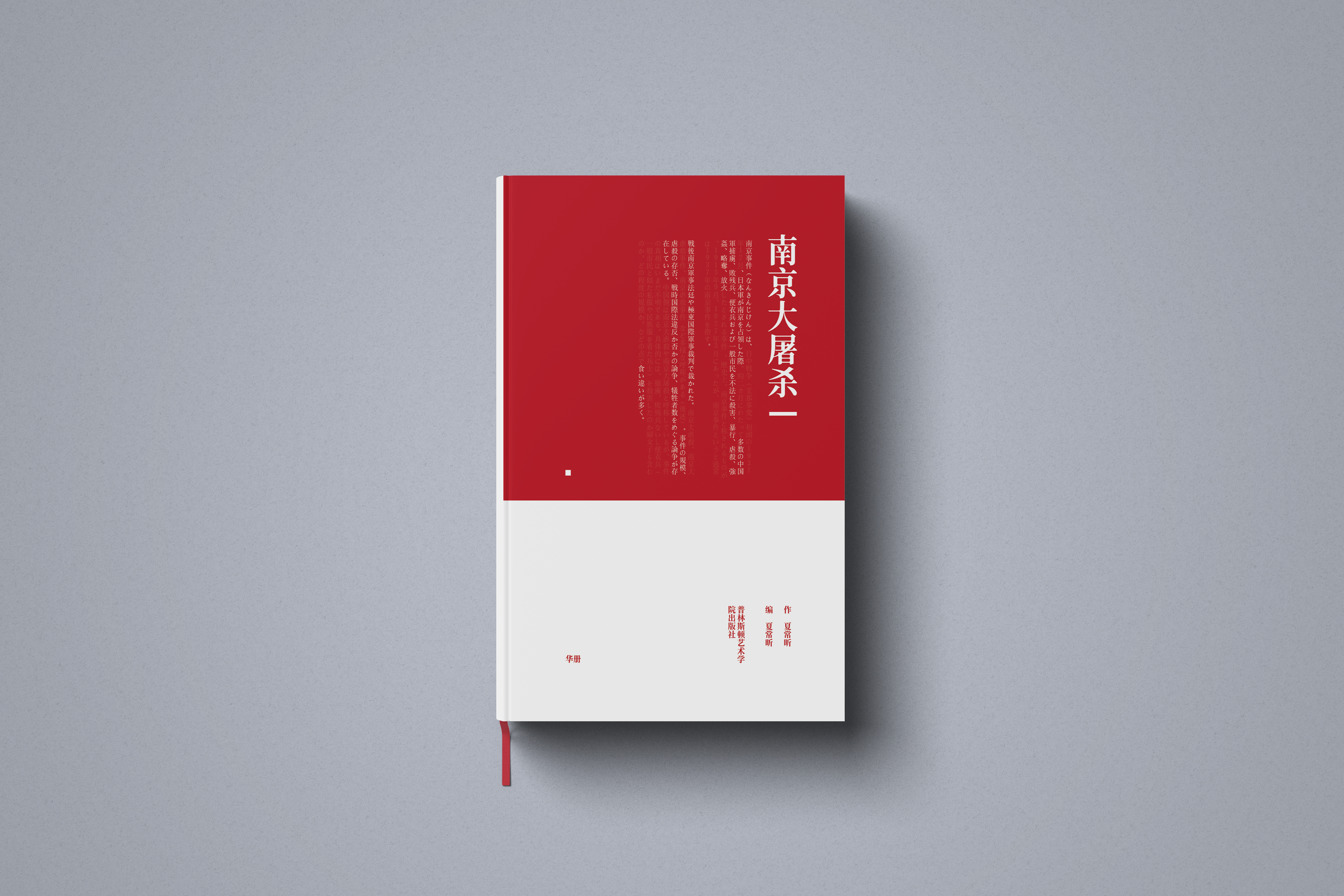
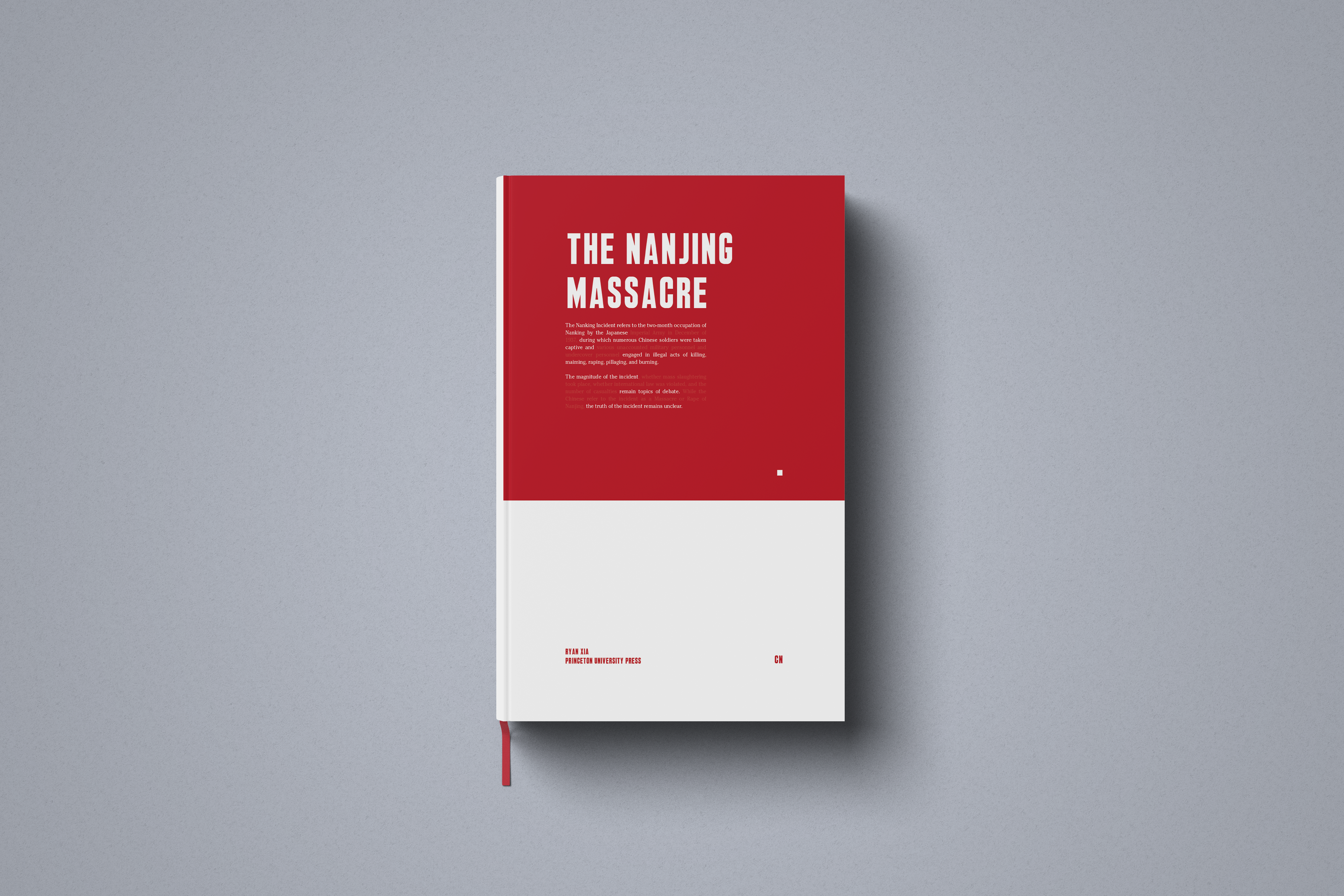
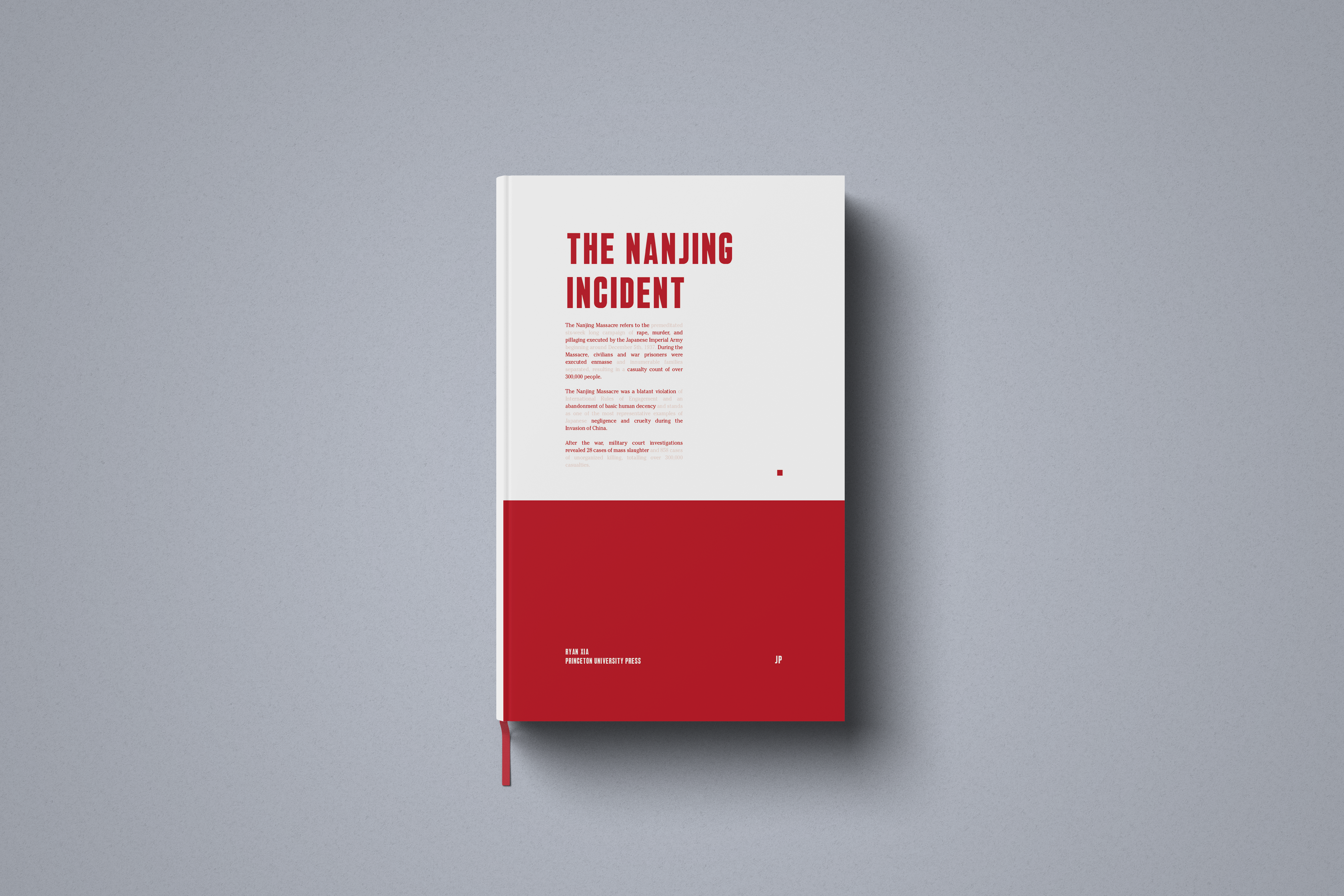
The Nanking Daily was an artist book project made as both a study of newspaper typography and an informational piece on the Nanking Massacre during the Second World War. The work is composed of articles and excerpts from several books, newspapers, and interviews from the Chinese, Japanese, and American perspectives in an effort to give sufficient context on the event.
Primary Challenges
1) Successfully mimicking the layout methods of archival newspapers from the Daily News in the 1930s while working with translated texts from different media.
2) Successfully treating images that were produced and printed using different methods.
Type Design, Typesetting
The Nanking Daily was an artist book project made as both a study of newspaper typography and an informational piece on the Nanking Massacre during the Second World War. The work is composed of articles and excerpts from several books, newspapers, and interviews from the Chinese, Japanese, and American perspectives in an effort to give sufficient context on the event.
Primary Challenges
1) Successfully mimicking the layout methods of archival newspapers from the Daily News in the 1930s while working with translated texts from different media.
2) Successfully treating images that were produced and printed using different methods.

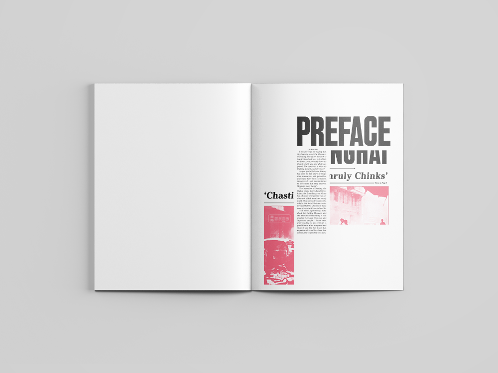
Step 1: Understanding the Typography
Going through Daily News archives, I found that Cheltenham was used for the body type and Daily News Gothic was used for the headlines. However, as Daily News Gothic had not been digitized, I created a font for the typeface for use in the project.
Going through Daily News archives, I found that Cheltenham was used for the body type and Daily News Gothic was used for the headlines. However, as Daily News Gothic had not been digitized, I created a font for the typeface for use in the project.

Step 2: Researching the Event
I then scheduled meetings with professors in the Princeton History and International Relations departments to decide on sources from the Chinese, Japanese, and Western perspectives. After deciding on sources, I chose excerpts and articles to feature in the book.
Step 3: Image Correction
As the grayscale images had different color rangers, neutralizing the differences to make the book feel more polished by limiting the images to a mono color scale of Japanese Red added both visual meaning and homogeneity among the content.